Graphic Design · Brand Systems · Visual Identity
Not decoration. Not templates. Designed systems that make your audience stop, look, and remember.
Yourbrandisn'tyourlogo.It'sthesilencebetweentheelements.Theweightofthetype.Thepausebeforethecolourhits.Everythingelseisjustdecoration.
The principle behind every project below
The Quiet
Rebrand
A 12-year-old consultancy had grown beyond its identity. The brief said "refresh." The real problem was they'd been invisible for a decade.
Version 14. The one that killed 13 others. The mark needed to hold at 12px and at 12 feet.
Week 3. The client loved version 7. I killed it at 2 AM when I realised the mark was just a confidence trick — it looked strong but said nothing.
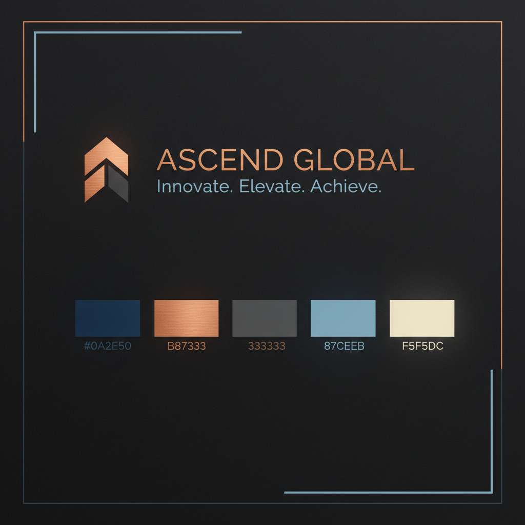
Stripped to a single geometric tension: two shapes that almost touch. That gap became the brand's entire personality — the pause before the answer.
3 enterprise RFPs won in the first quarter post-launch. The CEO said prospects were asking about the brand before the pitch even started.
When Everything
Needed to Speak
Touchpoints
Versions Killed
Team Trained
Weeks
"A brand system isn't a style guide. It's a set of decisions you make once so your team never has to make them again under pressure."
A Series A fintech startup had grown from 4 to 34 people in 18 months. Their brand had grown too — just in 34 different directions. The audit found 6 logo variants, 3 type systems, and a colour palette that changed depending on who opened the deck.
Audit & Deconstruction
Mapping every touchpoint — 47 inconsistencies foundSystem Architecture
Tokens, scales, and rules before a single pixel movesKilled Directions
6 full directions presented. 5 killed. 1 survived the brief.Rollout & Governance
Brand manual, component library, and a 2-hour team workshop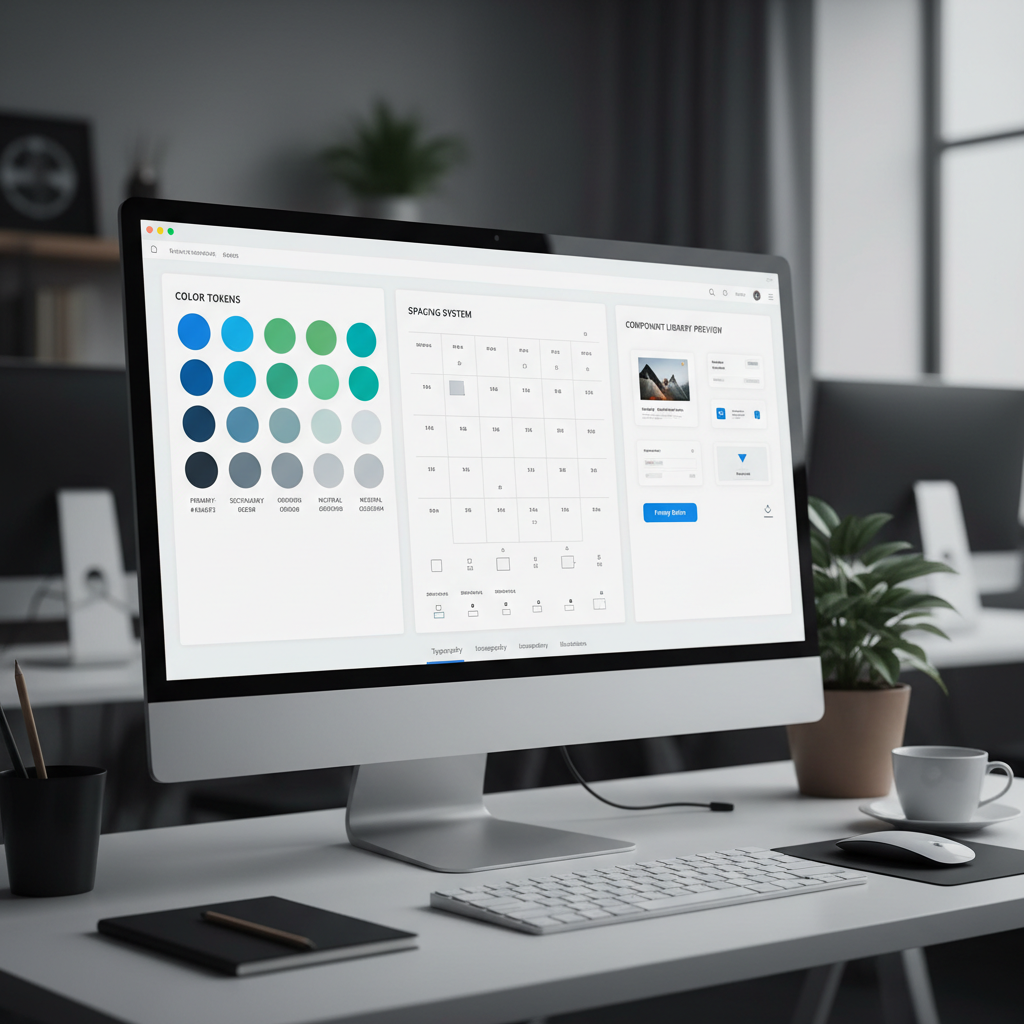
The One That
Moved Numbers
A challenger DTC brand with a product that worked and a story nobody was telling. The campaign wasn't about the product. It was about the moment before you need it.
Revenue in 90 days
Organic impressions
Conversion rate
OOH — 14 placements across 3 cities
Social — 34 assets, 1 system
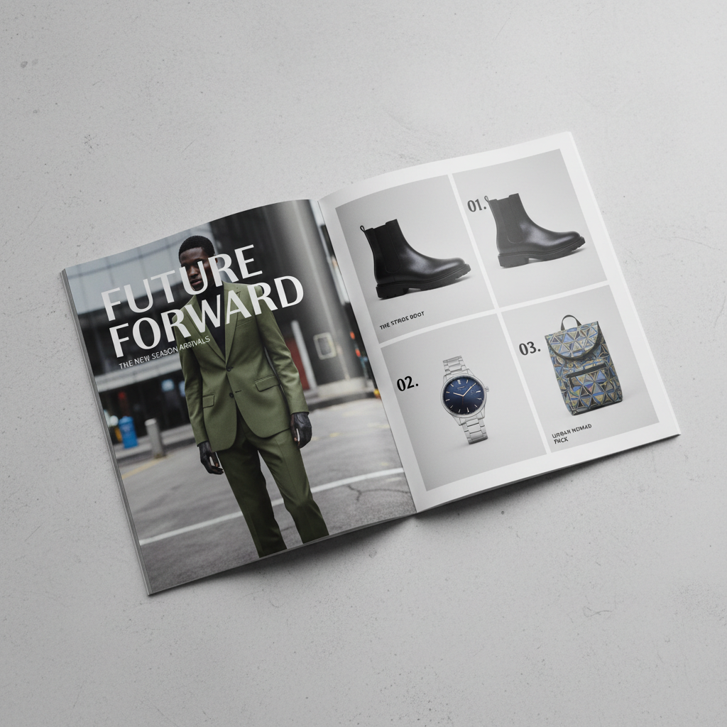
Print — 2,000 lookbooks, zero reprints
"The brief said 'awareness campaign.' We built a belief system. The numbers were a side effect."
Tell Me What's
Broken
No portfolio attachment. No 40-question brief. Just tell me the problem — I'll tell you if I can fix it within 48 hours.
Years of practice
Brands built
Revenue campaigns
Response guarantee